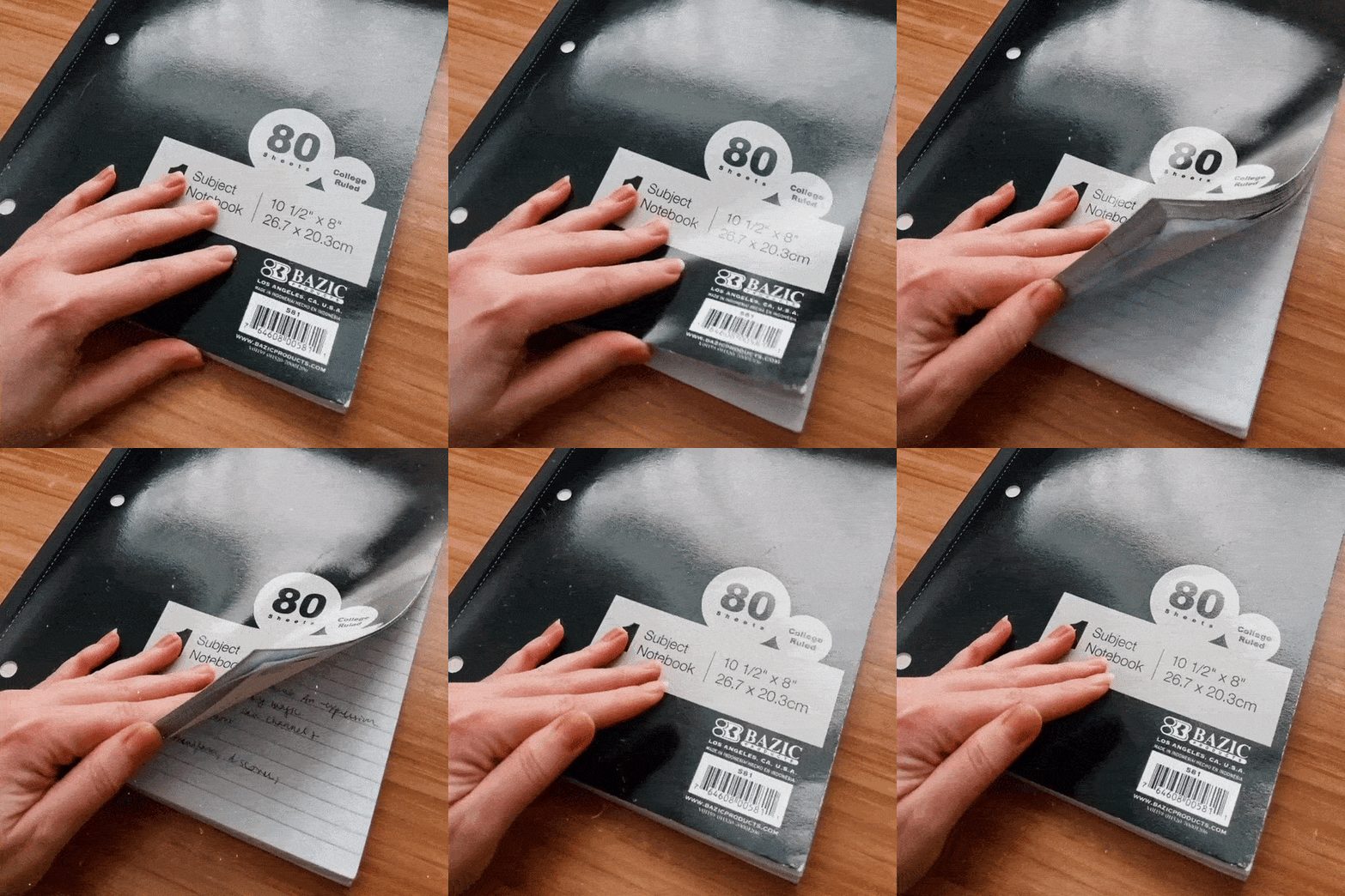
Ode to dollar store notebooks
As a graphic designer, stationery girl, and connoisseur of luxury printing, it’s time for me to own up to something…
I LOVE DOLLAR STORE SCHOOL NOTEBOOKS!!!
Yes, the ones with bright white, super-thin paper and margin lines that you used in high school. Especially the lay-flat perfect bound ones with binder ring holes. Also composition books. (Spiral bound is a crime against hand and wrist comfort imo.)
They are simple. They are consistent. You can find them anywhere. They aren’t precious. Just 80 COLLEGE-RULED SHEETS.
They are where I do my best work. They make me feel THE MOST organized and productive. And I revel in the soft, crinkly sound of leafing through dozens of wafer-thin, pen-indented pages.
BUT WHY, you may ask, clutching your Muji/Moleskine/Filofax...
Because when I have something “cheap” to play with, it’s so much easier to get my hands dirty.
When I’m not worried about wasting “nice paper,” I’m free to take risks — and when I feel free, I show up more fully and creatively than ever.
No need to have ideas or make sketches “worthy” of the finest journals. No need to conserve paper. No need to stay within the lines.
I actually wrote a full ode to dollar store notebooks this winter, when I switched over forever, and didn’t share it because I was a little embarrassed at the passion it provoked in me, lol. But here’s the key excerpt:
Thinking about the difference that the very notebook I use can make in how I show up to my business…
If these tiny details affect me, how do they affect the audience and clients I’m interfacing with?
If they are throwing off my ability to show up — I know they feel it, too.
Are there any details that have irked you about your design process that it’s time to smooth out, replace or upgrade?
More expensive is not always better. Simpler is not always better. Structured is not always better. It’s about what works for you.
And branding works the same way.
Is it time to let go of the not-quite-right brand that you’re still trying to make the most of… and upgrade to something that WORKS?
Now, I recognize that this may have been a seed of Intuitive Brand Kits.
They aren’t just the most affordable way I know of to get custom branding work that still looks expensive… even though it’s true ;)
They are priced for PLAY. For experimentation. They are certainly still special — much more so than generic notebooks — because each one is fully unique to its owner.
But a brand kit isn’t a precious set of rules. It’s not meant to define you, and you don't have to "live up" to it.
It’s just meant to be a starting point — a map to illuminate your options, and get you pointed in the right direction.
These Brand Kits are priced to be outgrown.
(And when you do, we’ll credit the cost to whichever larger branding package you choose to invest in next, as long as you don’t want something completely different by then!)
I HOPE you outgrow your brand kit — because in order to use it to its fullest extent, you will HAVE to experiment with it, play, and learn so much about yourself and your business along the way.
All I want is for you to feel free to try new things and get your hands dirty… and hopefully begin to enjoy the process of designing your content and creating things for your business.
If you have any questions about how to get there, my inbox is open.

