
Work in Process
The Swail Studio Blog about Branding,
visual identity, magic, and the void.

the brand designer needs a rebrand
I pieced together this brand for my past self: a strategic designer exhausted with freelancing for agencies that wouldn’t let me present my own work.
Now, after years of refining exactly what I’m best at and with new goals on the horizon, I’ve become something more: a psychic brand director for rebels and innovators who need their wild visions translated into luxury visuals.
the other kind of feed
Even the most creative and visionary business owners can get stuck in their own world.
If you’ve built a successful business, you know that even after years of refining, optimizing, and perfecting… you will lose perspective at some points. Things start to feel flat.
This isn’t a strategy problem — it’s is an energetic problem. And it can sneak up on you.
To the rebrand-curious but not sure if it’s THE move right now:
Playing around with your brand can be fun, revitalizing, and re-introduce a little joy back into your work.
But if you’re holding back on making overdue changes — or, on the other hand, changing it over and over — you risk losing trust. Which, imo, is likely THE most important piece of your marketing this year.
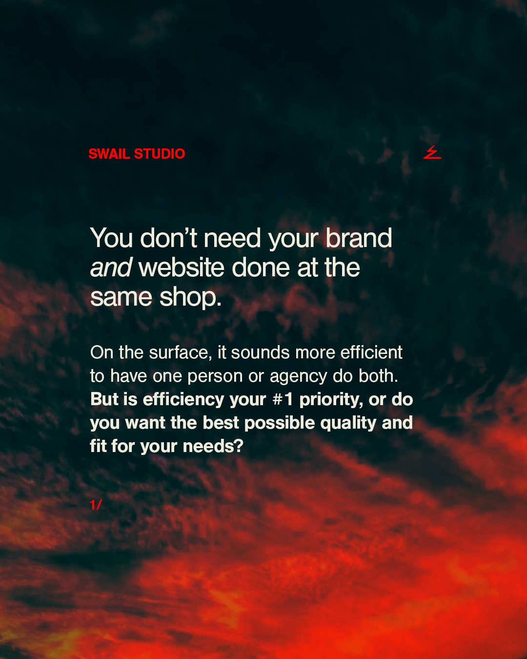
why i stopped offering websites
My genius is branding — not website design, not website development, and definitely not project managing website design and development through contractors.
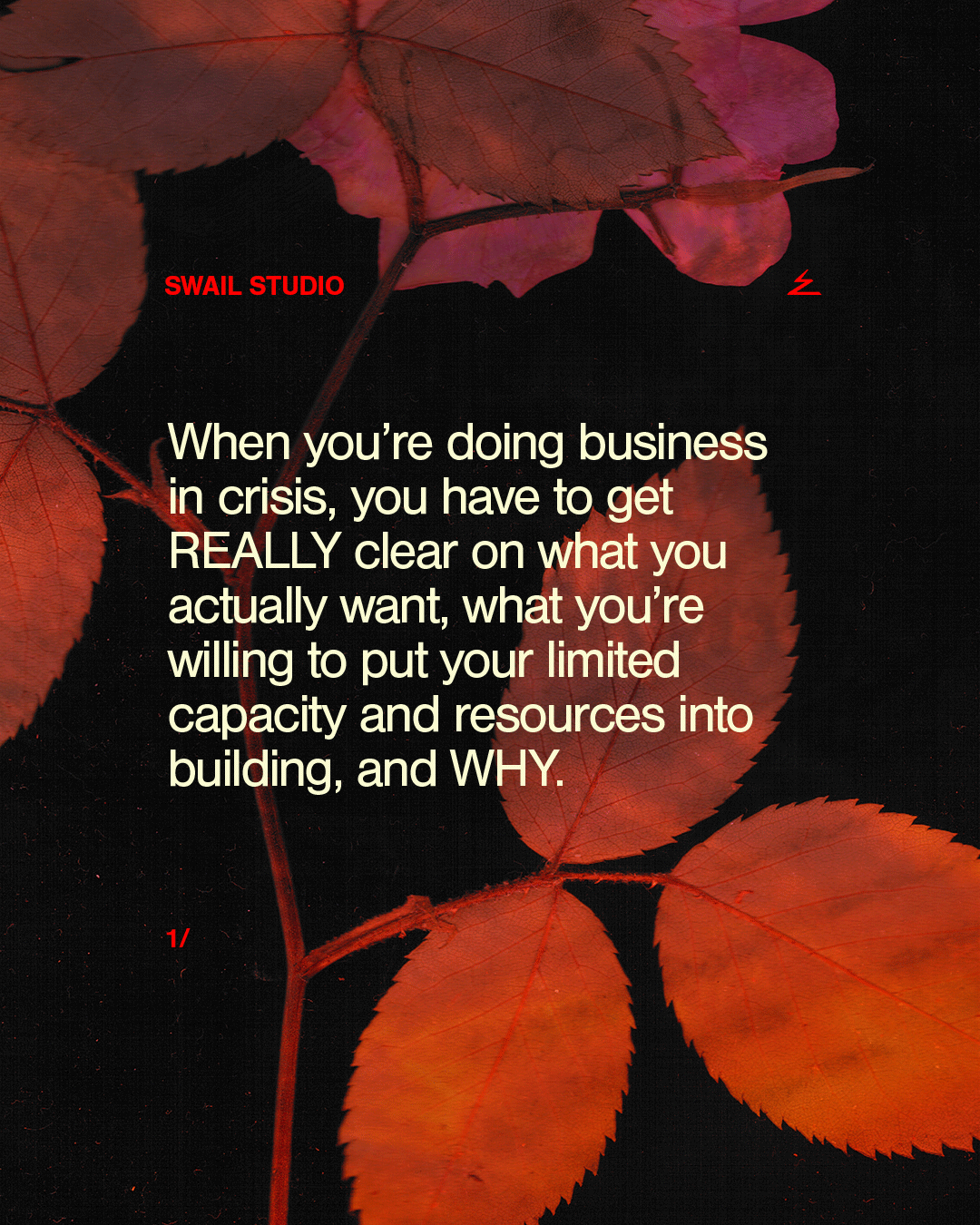
making shit work today, because it has to
This is when your brand has to be SO CLEAR that it cuts through the noise, cuts through the fears, and lodges itself deep in someone’s heart, where it could change their life.

have you ever had to decide who you want to be next?
I’m not talking about branding (how you are seen from the outside) — I’m talking about what’s underneath it.
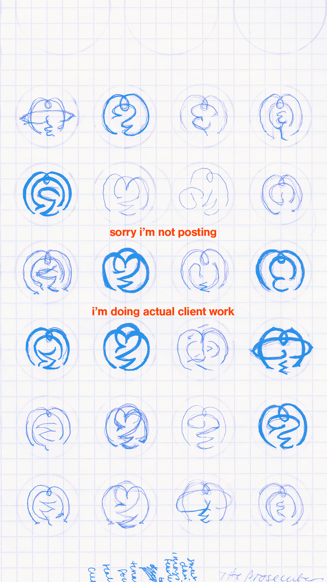
sorry not sorry
This post, my first in five weeks, had THE HIGHEST reach of any post I have made in the last 2 years.
Feel free to use any of my excuses for your own disappearances.
Looking like a leader ≠ looking "polished"
You own your bigness. Own your weirdness. Own your mastery. Own your legacy. Own your voice.
Looking like a leader doesn’t necessarily mean polish — it means looking different from what else is out there.
No, you don’t have to post photos of yourself.
You don’t need a huge professional photoshoot in order to create a fully “branded” website or post. Do professional photoshoots help? Absolutely. Do these methods perfectly replace them? No. But can you keep up a consistent brand aesthetic without fancy photos? Yes.

I won’t convince you that you need to rebrand.
My clients already value branding, and already have a budget for it. Their big decision is choosing the right designer or agency to make it happen.
When they find me, they often tell me that they immediately knew I would get them, and they are ready to go.
